Camera: EOS 7D
Lens: Canon 24-70mm f/2.8
Software: Photoshop CS6
I enjoy projects where I need to come up with a creative idea for something everyday, which I would typically not give a second thought.
The challenge here is to avoid conventional approaches and create something genuinely new, rather than just replacing the object in an already known subject.
Characteristics of a flower include colour and fragrance – two aspects to convey in an image, with colour taking the primary focus, of course. Colour is such a strong visual factor with flowers that I was confident a creative idea would come to me. This led to the chain of associations: 'flower,' 'fragrance,' 'cosmetics,' and eventually, the idea of a cosmetics advertisement.
Now, everything proceeded as planned: I headed to the local wholesale flower market and looked around. Earlier, I had already acquired lipstick and nail polish, both in a beautiful intense shade of red. However, all the red roses I found were unsuitable. I needed a perfect specimen that had to meet the demands of a close-up shot under studio lighting conditions. This meant that the flower couldn't have the slightest flaw, as any imperfection would immediately catch the viewer's eye and be distracting. Fortunately, there were pink roses that met these requirements. I chose one of them, exchanged the cosmetics for items of the matching colour, and got to work.
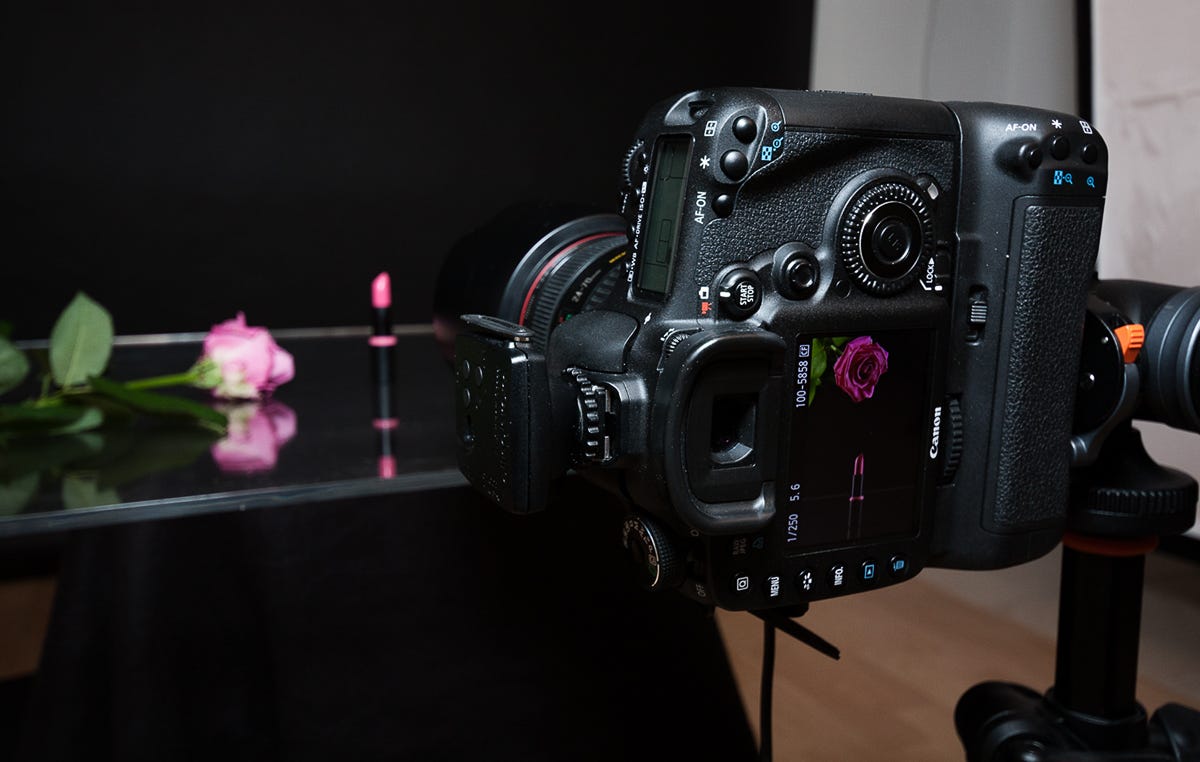
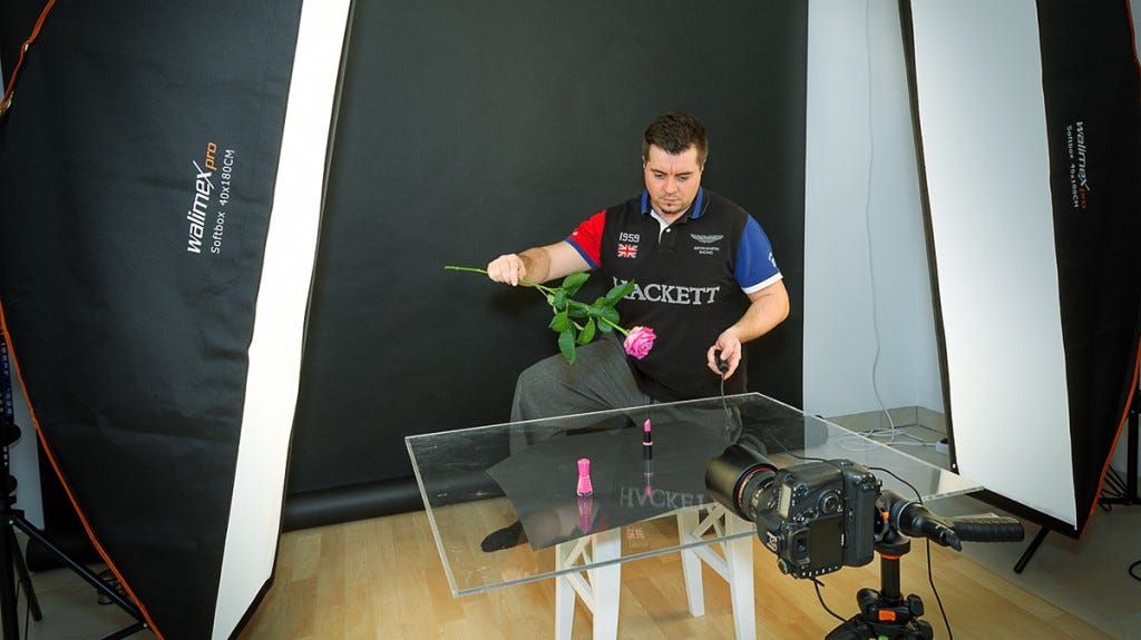
I quickly discovered that pink looked much better against a black background than a white one. I placed the lipstick on a small sheet of plexiglass, which I had positioned on a piece of black paper to create a reflection. The lighting setup involved two Elinchrom 500W BRX lights, each equipped with a 1.80m strip light. I placed them on either side and behind the subject, which would create an impactful reflection on the lipstick. I attached my trusted Canon 24-70mm f/2.8 lens to the camera, mounted it on a tripod, then focused on the lipstick and turned off the autofocus.
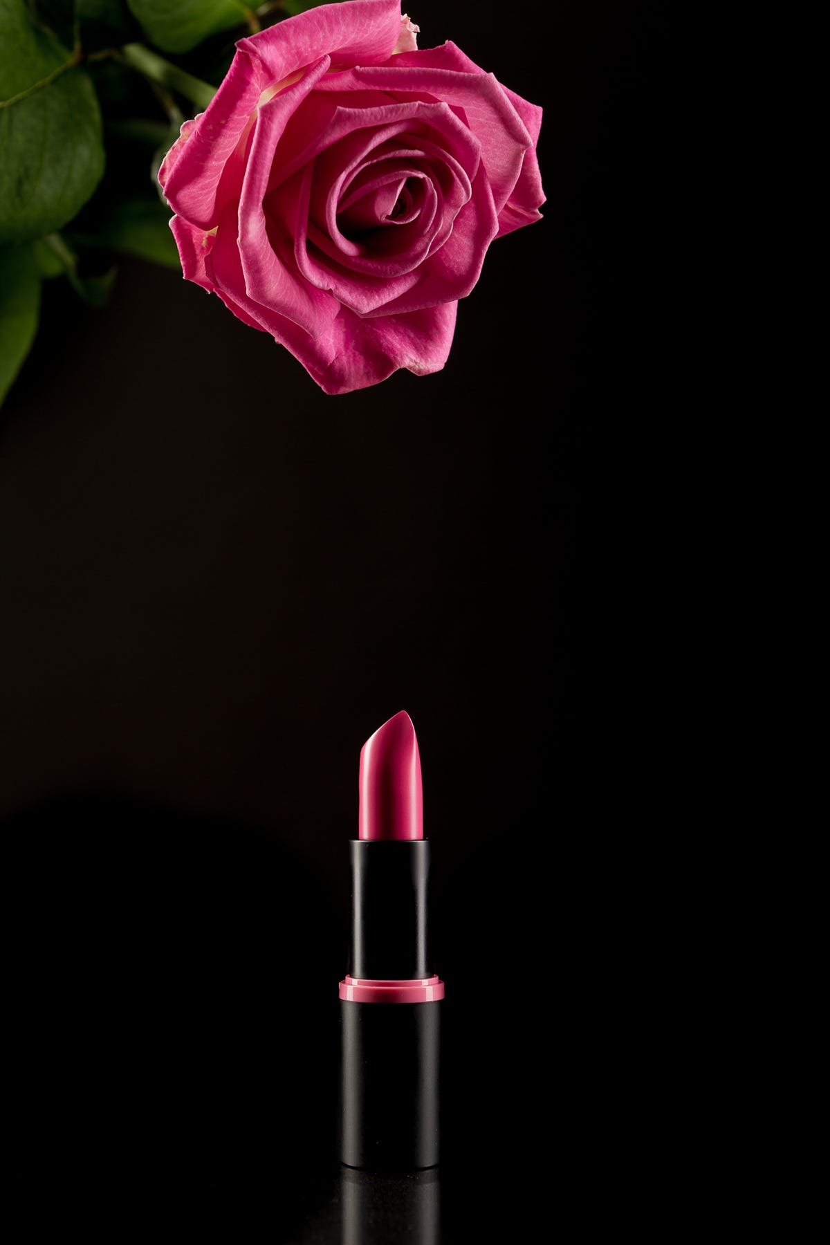
With the cable release in one hand and holding the flower in position with the other, I took multiple shots. This way, I at least got a clean image that I could use as a base.
I set the rose aside, took the nail polish, and carefully dripped several drops onto the lipstick from the same height at which I had held the rose while repeatedly pressing the shutter button. I repeated this process one more time to ensure that I had various drop configurations to choose from.
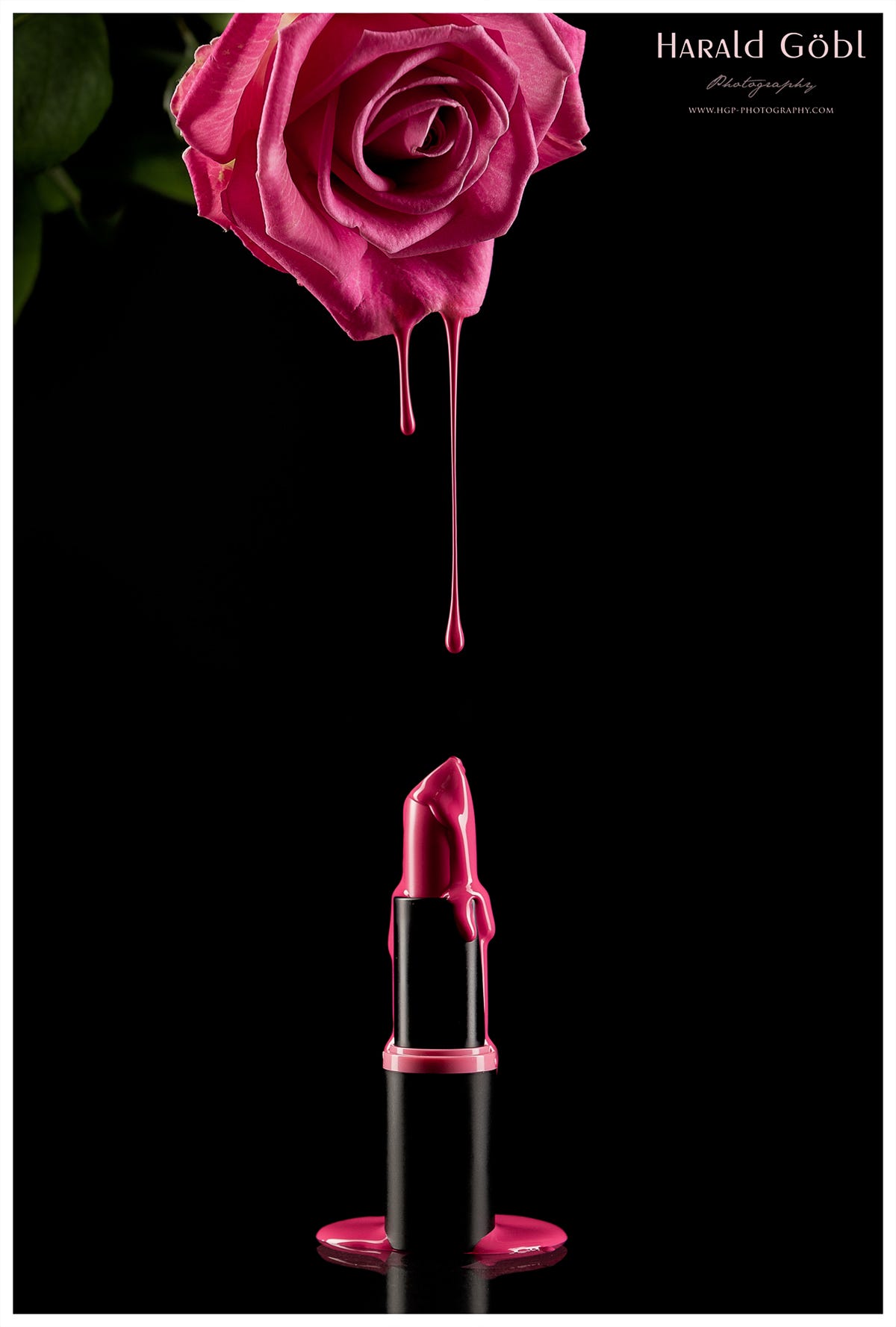
After loading the images into Photoshop, I first selected the lipstick photo I wanted to use. Then, I opened the photos that showed falling nail polish drops. The ones I liked were added as new layers on top of the lipstick image. By changing the blending mode of the drop images to "Lighten," only the drops that appeared in my image remained, making it easy to delete the ones I didn't want. Then, I just needed to paste the rose image and carefully position it in the right place, zooming in on the drop layers to ensure a seamless transition between the drops and the rose.
The result is a simple, clean photo for a cosmetic advertisement, making it appear as if the lipstick colour is flowing out from the flower.
This is it!
Learn, create and inspire together!


Great idea and perfect execution! Thanks for sharing!
Pretty damn cool and generous of you to share.